Component Classes
Applying Classes to Adaptive Components
The purpose of this page is to provide a succinct list of useful classes that can be applied to components in adaptive designer. To apply a class.
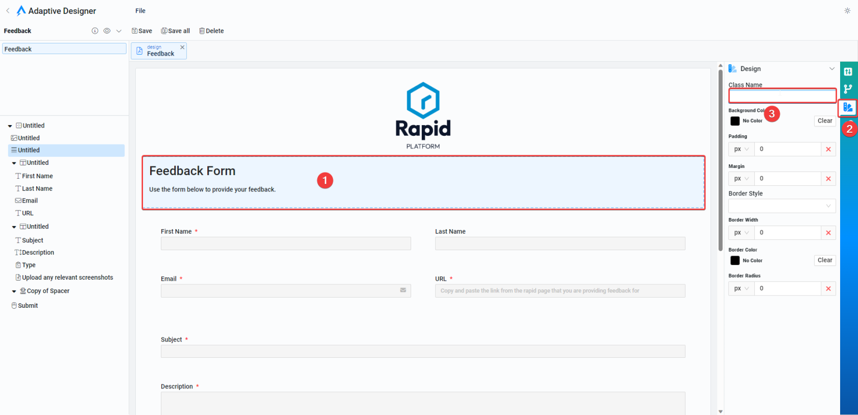
To apply a class simply:
- Select the component in adaptive designer
- Select the styling tab on the right of the screen
- Enter your class name in the Class field

Useful Classes
| Class | Component type | Description |
|---|---|---|
| rp-text-right | Most components that include text - Single Line fields, Multi line, Static Text etc. | Aligns the text within these components to the right. |
| rp-text-center | Most components that include text - Single Line fields, Multi line, Static Text etc. | Centers the text within these components |
| rp-margin-top | Most components | Adds margin to the top of the component |
| rp-margin-bottom | Most components | Adds margin to the bottom of the component |
| rp-margin-left | Most components | Adds margin to the left of the component |
| rp-margin-right | Most components | Adds margin to the right of the component |
| rp-input-heading-h1-6 | Single Line of Text Fields | Makes the text look like and input field. |